
Welcome to Hot Pod, a newsletter about podcasts. This is issue 180, published October 9, 2018.
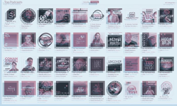
Have the Apple podcast charts felt weirder lately? Here’s a familiar scene: I’m trying to pass the time, so I pull up the Apple podcast charts to see what the youths are up to. (Ha.) This was my Sunday afternoon, and by that point, I hadn’t looked at the charts in a good few weeks. Part of this has to do with the way I learn about new projects these days: press releases, emails, text messages, phone calls, even a postcard once. But it mostly has to do with the fact that I haven’t found the Apple Podcast charts particularly useful in quite some time. Not for my purposes, anyway.
On Sunday afternoon, this is what I saw:

There’s a scene in The Matrix where that one creepy white dude looks at a cascading wall of code and says, “There’s way too much information to decode. You get used to it, though. Your brain does the translating. I don’t even see the code. All I see is…
